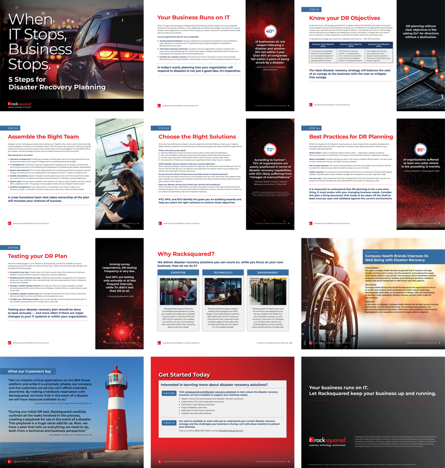
At a technology-focused agency like DeLaune, we’re called on to create a lot of digital marketing assets. That means we think a lot about the ideal form of different collateral types—and white papers are a good example.
Focused, practical and digestible
The most defining characteristic of white papers is that they’re focused, practical, and digestible. Whatever their topic, even in the world of information-laden digital marketing assets, they should be proudly informative: White paper readers are busy and motivated.
Whether a white paper explains industry trends, describes a new technology, or outlines a family of services, you should think of your audience just that way. Here are three specific tips that make for an effective end-product:
Emphasize context
White papers, by nature, are focused on a particular topic of interest. However, it’s all too easy for them to start off without setting the stage for the reader. Ever read a white paper with a section point-blank called “Who is this document for?” I have! (And appreciated the bluntness.) It doesn’t need to be that bald, but be sure to include enough context that readers instantly know the topic and whether the paper is relevant to their needs. If the paper refers to software features, be sure that the software is fully described, down to the version number. If you refer to outside sources, add citations to make it easy for your readers to find them—complete with URLs, if possible.
Voice and vocabulary
Use the right voice and vocabulary. A white paper may be translated or used as a reference for your salesforce. That amplifies the importance of using terms common to the relevant industry and sticking with concrete, unambiguous language. So write as plainly as possible. When in doubt, providing more explanation of how you’re using terms (in the form of a glossary or with explanations embedded in the text) is kinder to your readers than leaving it out.
Consider the illustrations
Think about your illustrations from a naïve reader’s viewpoint. White paper illustrations may be chosen for their technical merit rather than their visual appeal. But technical doesn’t always mean informative or comprehensible; too often, it’s the opposite. Some white paper illustrations can resemble a complex subway map—without a legend! Think of your illustrations in the framework of user-centered design, and scan them for common problems, including:
- Uncomfortably small text
- Poor contrast
- Clutter
- Missing information, such as labels for the axes of a plotted graph
- Unexplained or ambiguous acronyms
- Missing captions
Following these three rules won’t automatically make your white paper perfect, but it will help you avoid some common pitfalls.
DeLaune and Associates gets technology marketing. We’re always ready to to craft digital marketing assets. Click here to get started.


